White Bird Productions aimed to create a refreshed logo that reflected its core values while building upon its existing visual identity. At the center of the organization’s mission was a commitment to connecting people to their communities, to the natural environment, and to activism and the arts through the power of storytelling. The project sought to visually represent this intersection of creativity and community that defines White Bird’s work.

Logo Process
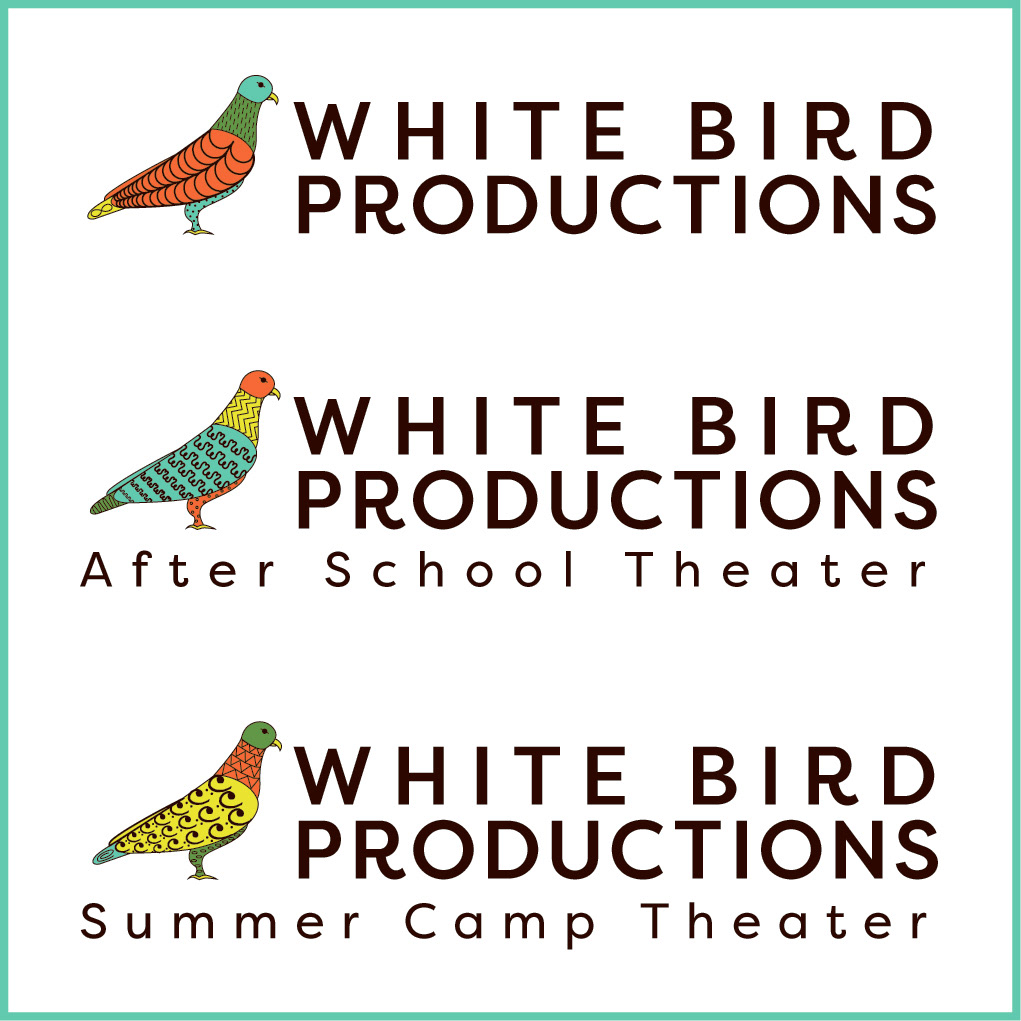
The primary goal was to design a logo that clearly communicated who White Bird Productions is and what it offers. As a theater production company, an after-school theater program, and a summer theater workshop, White Bird provided year-round opportunities for artistic expression, education, and engagement. The logo either needed to reflect all of these facets in a cohesive and meaningful way.
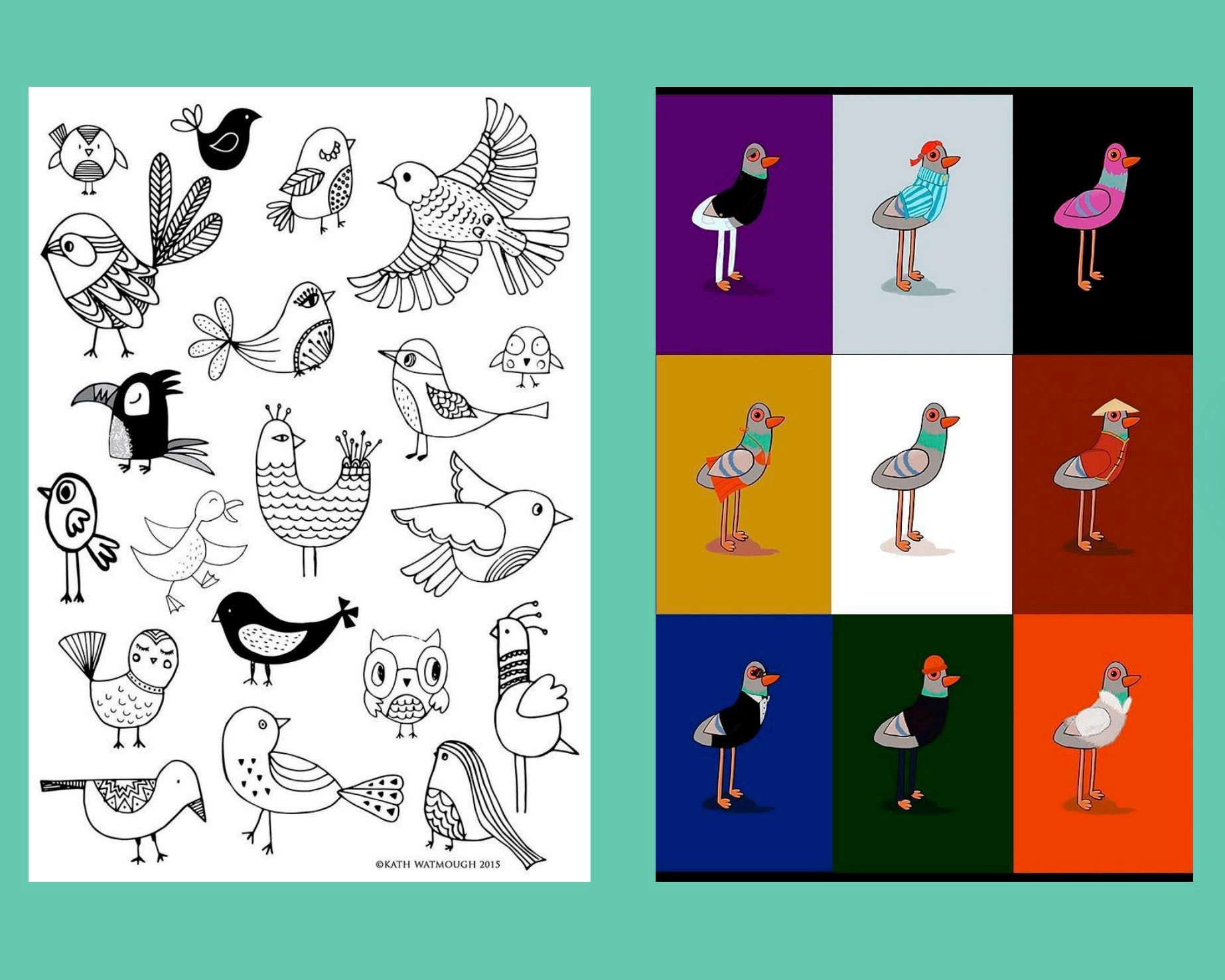
Inspo & Moodboard
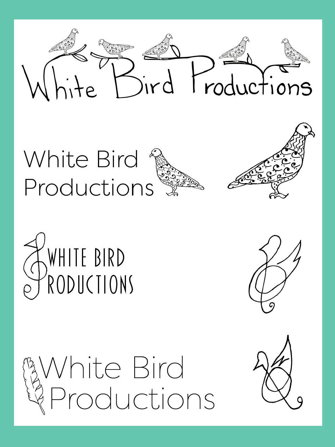
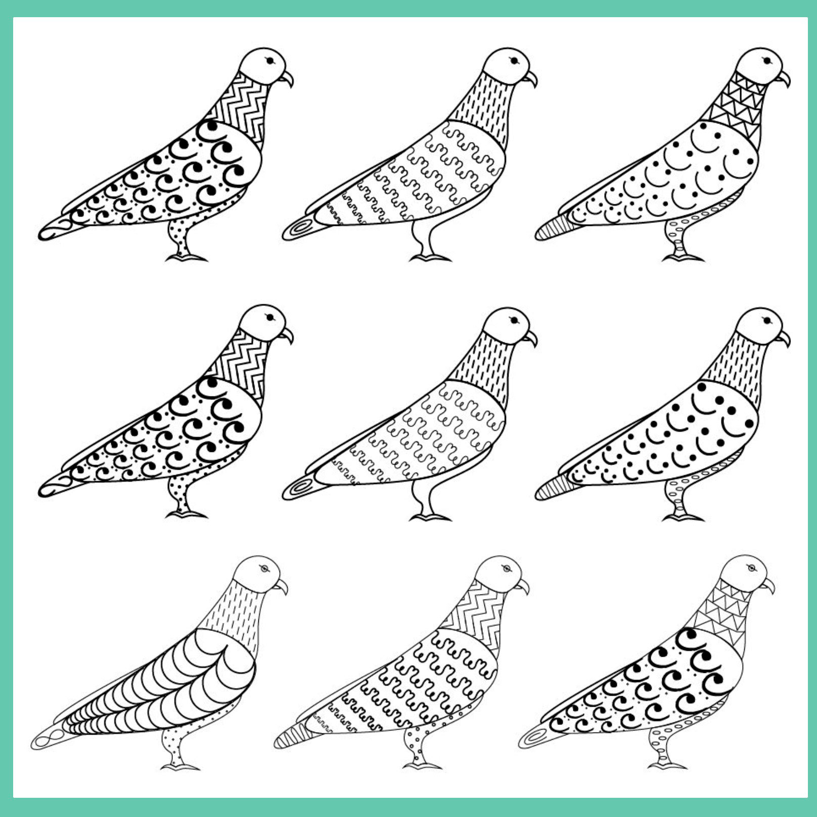
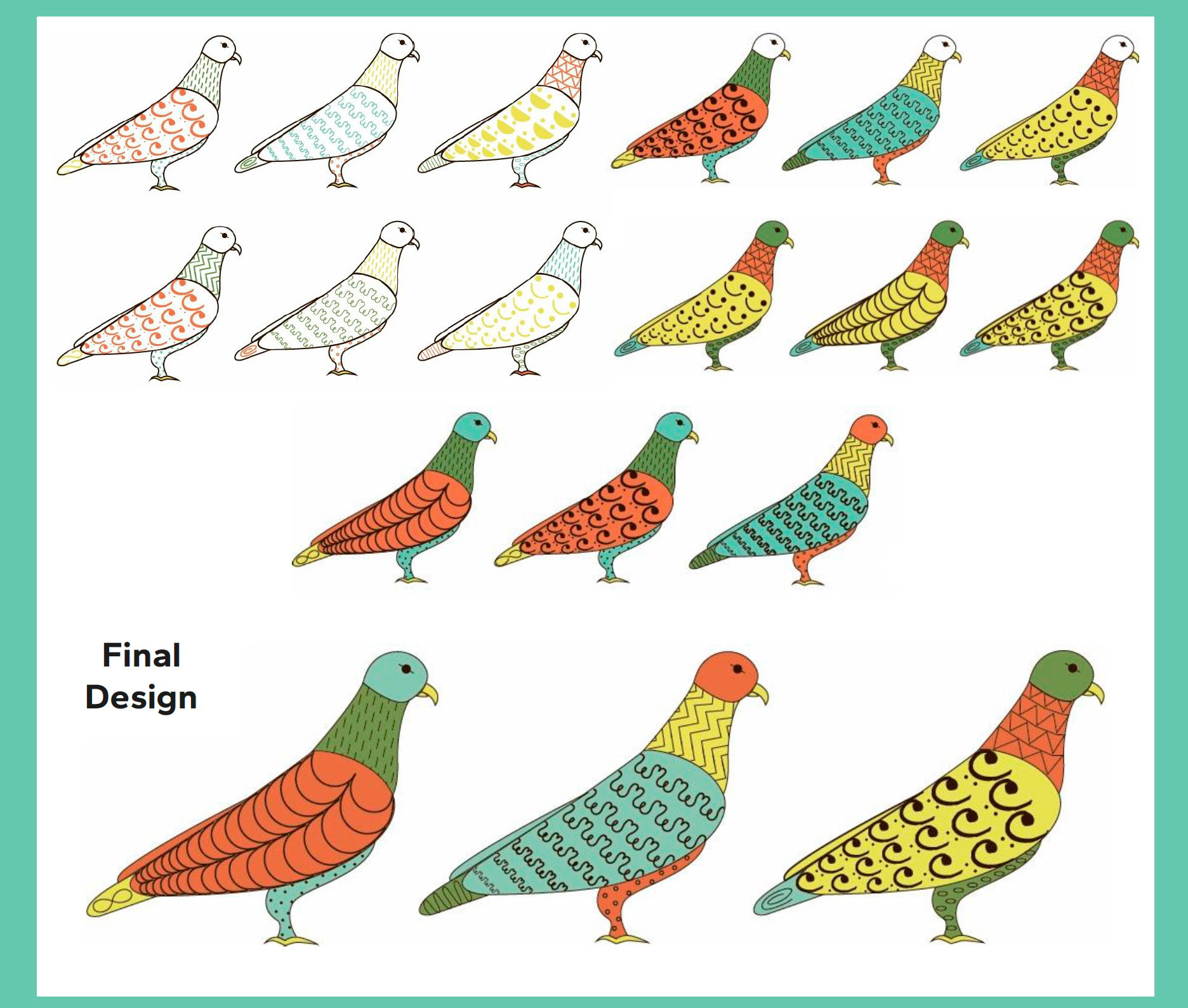
My thought process: what represents the brand's originality, quirkiness, vibrant, and fun atmosphere. For my logo concept, I created a moodboard that captured the originality and quirky energy of White Bird Productions. I drew inspiration from shapes and patterns that felt playful and dynamic. The moodboard helped me visualize how the brand could appeal to both kids and adults. I wanted the design to feel fun without being childish, creative without losing focus. This step helped me narrow down which elements—like color, texture, and form—best expressed the brand’s personality.
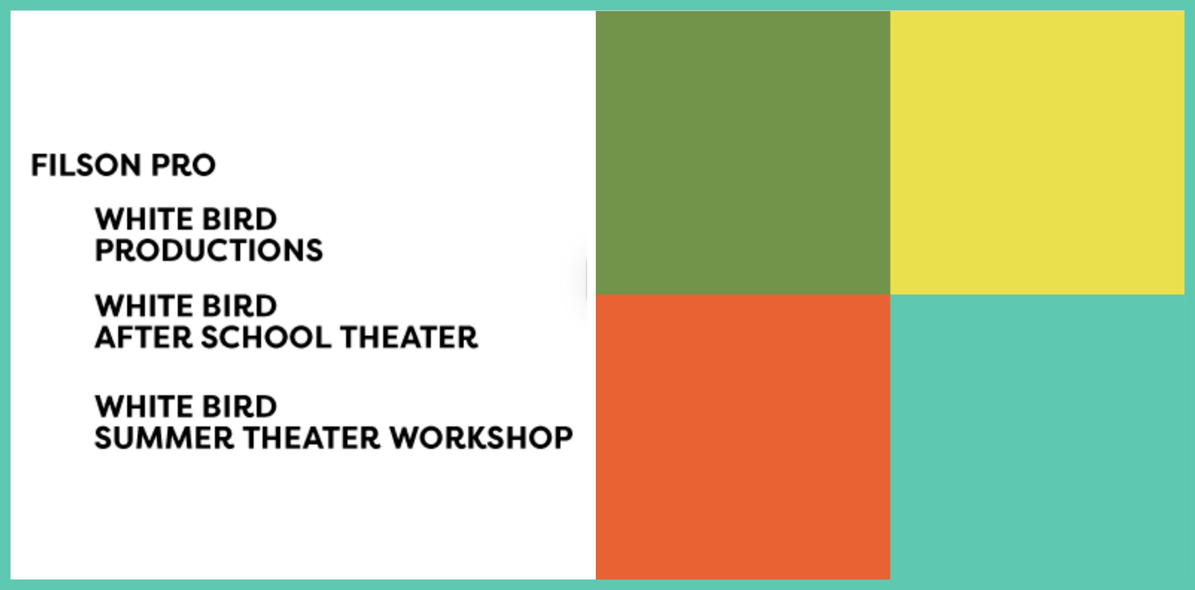
We explored several typefaces before choosing fonts that conveyed sophistication and warmth. I personally liked Filson Pro because it had a clean, professional look while still feeling approachable. The swash details in the letters added character that reflected White Bird’s creative side. Typography played a huge role in making the brand feel trustworthy and refined. It was important to us that the text balanced the playful logo concepts without losing professionalism.
When developing the color palette, we focused on shades that represented community, nature, and optimism. Orange, yellow, and green were chosen because they express energy, growth, and friendliness. These colors aligned perfectly with White Bird’s mission to create a positive and inclusive space. We also wanted the palette to work across different programs within White Bird Productions, like after-school, summer, and professional theater. The bright yet balanced tones helped give the brand a unified and inviting identity.